A business-intelligence platform for Deloitte & Walmart
Visualizing retail supply-chain transformation.
We love business intelligence.
At Sharpen, our design strategists have a curious love for business-intelligence solutions. The world is a complex place and all too often the way companies and products analyze and visualize that complexity leads not to insight and action but to complication and paralysis. This danger is especially true of the most complex systems we rely on every day: Supply chains.
Members of Deloitte’s retail technology team approached the BI experts at Sharpen (then J+E Creative) looking for help visualizing the complex non-linear processes that retail giants like Walmart and Kohl’s use to bring products from all over the world to your neighborhood. In particular, Deloitte consultants were looking for the most effective way to show how bleeding-edge robotic and cognitive automation can revolutionize those processes and transform their clients’ retail supply chains.
Working with Deloitte’s detailed logistics data, Sharpen’s team used sophisticated data visualizations and video-game inspired interfaces to contextualize customer-experience and business-opportunity insights for users at both the executive and the tactical levels.
These complex business analyses—many of which defied conventional visualizations and linear hierarchies—came to life through relational interfaces and interactive graphs which gave users the ability to view data in a variety of ways while also helping them understand what the data are saying and how it fits into the enterprise’s big picture. And as the data change and grow, so do the visualizations representing them, letting executives and consultants alike keep their eyes on opportunities and impacts that matter the most to their businesses and their customers.
Let’s take a look at how we took a consultant’s great idea and a pile of raw data and turned it into a business-intelligence experience that made retail supply chains accessible and beautiful while also growing Deloitte’s business and improving their clients’ processes.
CLIENT
Project Services
– Competitive & Comparative research
– User & stakeholder needs alignment
– Experience design
– Data visualization
– User interface design
– Prototyping
– Usability testing
– Development handoff
– Platform training
Project Size
$50,000 to $199,999
Project timeline
Eight weeks
A tale of too much data.
Working with Deloitte on their retail supply-chain BI platform, we knew from the outset that our solution would need to be as easy for their enterprise-retail clients to decipher as for Deloitte’s subject-matter experts. Thus, the matter of how to visualize and understand relationships across organization value streams without a current-state product serving as an example was already a tall order.
Then we got our hands on the data.
Part of the challenge with any business-intelligence or data-visualization project is the data itself:
Where does the data come from?
How much data is there?
How is the data organized (both taxonomically and systematically)?
Who’s going to be accessing the data?
What insights are the user hoping for?
What insights does the data suggest?
What kind of device (or context of use) will the user be using when they interact with the data?
But Deloitte’s retail supply-chain dataset was huge even by the standards of the enterprise clients with which we frequently partner. Their data tracked over a thousand unique, non-linear processes organized across multiple tiers levels into 14 parent categories, with all the various dependencies and inter-relations one might expect from a truly global supply chain. And it had to make sense to users with no data-science background using laptops or viewing the platform on a conference room TV.
So, we started as we often do—with pen and paper, quickly exploring a hundred ideas before settling on the few that best combine the business and technical requirements, the user needs, and the technical capabilities of the target platform.


FROM SKETCHES TO SOLUTION
Starting with analog sketches allows our design strategists to explore a wide variety of ideas quickly without the limitations inherent in high-fidelity visual design tools. Often, sketches are easier for clients and other non-designers to understand, compared to low-fidentity digital artifacts like wireframes. What’s more, anyone can sketch an idea—on a napkin, a markerboard, or even a window. Plus, they’re fun. 😇
A view from the top.
From the outset, our Sharpen design strategists knew we were designing a business-intelligence platform for two discrete audiences with very different agendas:
A strategic-level executive user, interested in the macro economics of retail supply chain, and
A tactical-level operation user, interested in specific pieces of the process or invested in particular robotic or cognitive automation applications.
For the strategically-minded user, our solution offered a variety of high-level features:
A MAP TO RETAIL PROCESSES
A high-level strategic view showed all 14 retail process clusters on a video-game inspired isometric map using simple icons to highlight each process.
THE ABILITY TO DRILL DOWN TO UNDERLYING CAPABILITIES
Either initiated from the map view or from the menu, users who select a retail process cluster can then choose from among related capabilities. Each capability features a unique icon and a pair of percentile indicators—for business impact and cognitive opportunity—to help users make informed decisions about which capability to investigate further.
A LAYERED NAVIGATION
Alternatively, users can use a floating menu button to access a layered navigation that correlates to the map view, providing direct access to the 14 retail process clusters for new users or users who need additional clarity.
CAPABILITY DETAILS
Revealed within each capability selection, users access a variety of data that illustrates both the cognitive opportunity and the business impact—as a data visualization and as a detailed list of features.
A view from the trenches.
From the outset, our Sharpen design strategists knew we were designing a business-intelligence platform for two discrete audiences with very different agendas:
A strategic-level executive user, interested in the macro economics of retail supply chain, and
A tactical-level operation user, interested in specific pieces of the process or invested in particular robotic or cognitive automation applications.
For the tactically-oriented user, our solution offered a variety of detailed features:
ALL DATA—NO METAPHOR
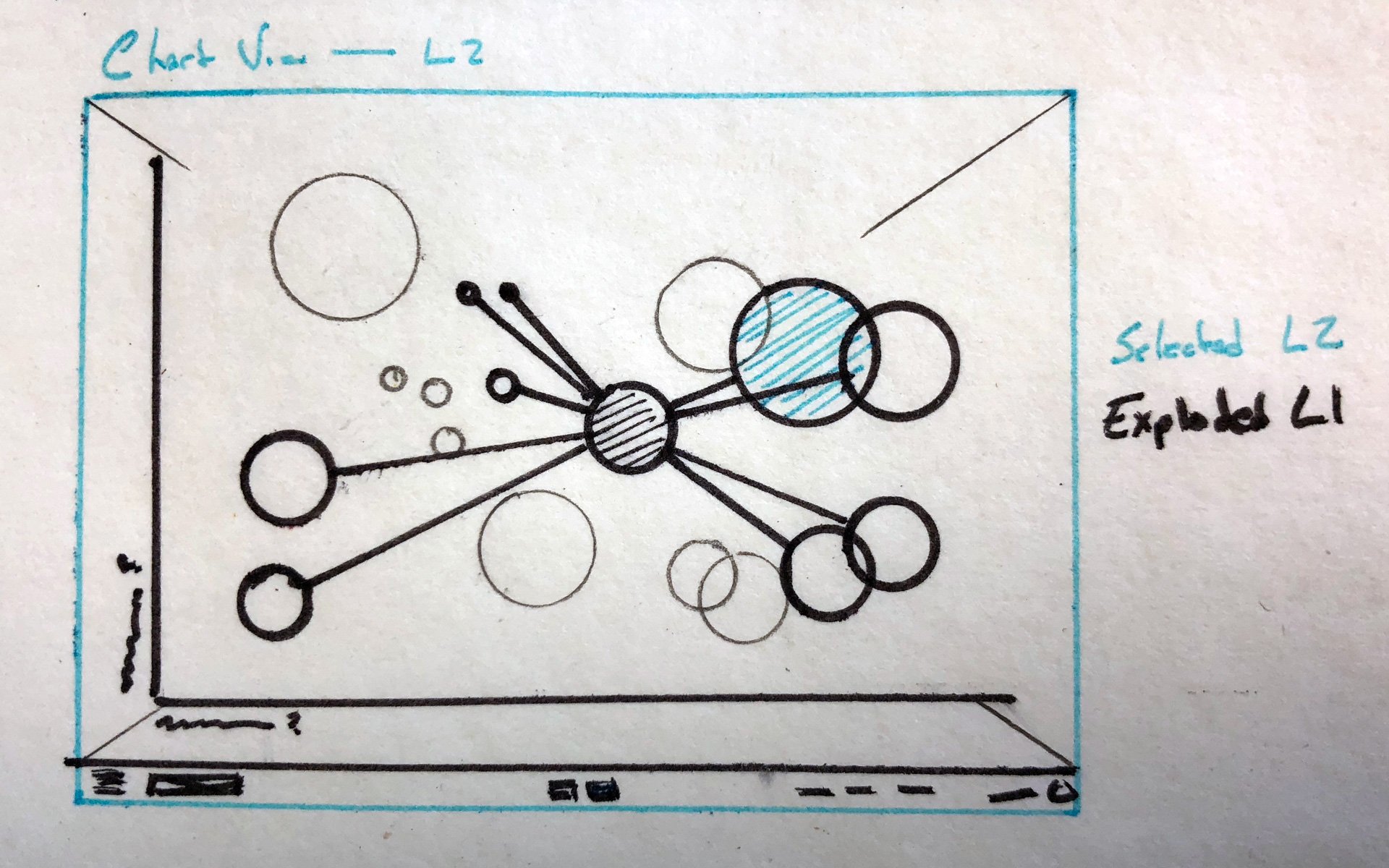
As an alternative to the metaphorical illustration created as an executive overview, a data visualization view reveals all capabilities scaled in accordance to the business impact and cognitive opportunity values.
CAPABILITY SNAPSHOTS
Each bubble in the data visualization reveals the underlying data, helping users understand the impact and opportunity in each.
LET THE DATA SPEAK FOR ITSELF
Complex data often presents unforeseen insights—by exploring different visualizations, we can find these valuable signals and elevate the conversation.
ZOOM IN FOR THE GOODS
User can zoom into category bubbles for a detailed view of that cluster’s processes.
FIND THE OPPORTUNITY THAT MATTERS MOST
A variety of filters make the data visualization ever more valuable, providing options that filter or segment the data by specific values or categories. Intelligent filtration and segmentation promote higher levels of discussion and drive business.
Save money. Deliver better.
Our design strategists worked with Deloitte subject matter experts using two different retail supply chain datasets—Walmart and Kohls. So, in addition to building a robust business-intelligence platform that rendered an incredibly complex series of processes understandable, available, and actionable we also needed to make it re-brandable.
Fortunately, our approach to interface and data visualiztion was atomic, utilizing a bespoke interface library that allowed the original illustrations, charts, typography, and UI elements to adapt to today’s various brand needs as well as to tomorrow’s fresh opportunities.
At Sharpen, we love complex problems and delivering intelligent solutions that make the world a better place in which to live and work. Sometimes, it’s a killer app which helps long-haul truckers find a safe place to park. Sometimes, it’s an enterprise business-intelligence platform that amplifies the voice of the customer or translates the arcane into actionable insights. But always, it’s a combination of research, empathy, care, and smarts that draws a straight line from the user’s need through the business’ goal and on toward the greatest good.
If you have a complex business problem and you’d like an expert design team to come in and save the day, get in touch and let’s make a difference.
[Our designers] have been so responsive, organized, and creative ... I really appreciate the amount of thinking that goes into this because it’s super complex. I wish we’d been working with these guys from the very start.
– Senior Manager,
Sales Technology & Digital Innovation, Deloitte Consulting